Diving into ant-design internals: Button
As a Rails developer, I learned a lot just from reading Ruby on Rails code. Aware of that experience, I try to look into the internals of other open source projects as well, to see what’s going on there.
It has two primary benefits:
- You will most likely better understand the project, its API and learn a few programming tricks.
- It demystifies the library or framework that you use.
We often put some open source libraries or frameworks on a pedestal and think that we, mere mortals, cannot produce such code. That it is beyond our level of skills. Reading the code of libraries, that you use, can teach you that many (not always all) parts of their code are approachable and possible to understand. That’s a first step to contribute or start your own project. Feeling empowered that you can. And that you would be useful to the team.
A few months ago in one of our project, we started using ant-design (antd in short). We did it for similar reasons that you could bring Bootstrap into your project. You want at least a few higher level components then what HTML gives you. And not just static HTML/CSS components which have a certain look and feel, but dynamic interactive components that you can build interfaces with. I still sometimes have a feeling that Web ecosystem is years behind Desktops in terms of re-usable, high-level components. And antd fit nicely into our existing React ecosystem. Provided a lot of components that we could use in the future or replace existing ones with them.
So let’s see what’s inside one of the most basic class you could imagine - Button.
TypeScript?
My first surprise was that Ant Design is written in TypeScript. I never used, read or edited TypeScript before but the syntax of the component looked so similar to modern JavaScript that it did not prevent me from reading the code. Still very low-level barrier.
handleClick
Let’s first have a look at handleClick which is
triggered when you click the button (obviously 😜 )

handleClick = (e) => {
  this.setState({ clicked: true });
  clearTimeout(this.timeout);
  this.timeout = setTimeout(() => this.setState({ clicked: false }), 500);

  const onClick = this.props.onClick;
  if (onClick) {
    onClick(e);
  }
}
So what does the handler do?
- It changes the internal state of the component that it is
clicked. Which I believe, with re-render and a change of CSS class, triggers the animation. - It schedules a callback changing the state back to its initial value (
false) 0.5s after the click. - It cancels previously scheduled callback (no matter if it already fired or not, canceling already fired timeout callback would do nothing anyway).
- If
onClickhandler was provided viapropsto the button, it is triggered as well.
Interestingly the identifier of the timeout you want to cancel is
stored as component property this.timeout and not in state or props.
I’ve seen this technique being used a few times for storing technical component
state which does not affect its rendering. Because rendering only cares about
state.clicked.
Surprisingly (or not): If you keep clicking faster than once per half a second the state
will continue to be true without going from true, to false, to true. Just true, true, true…
Because the timeout callback won’t have enough time to be executed. It would be
canceled all the time.
You can read more about setTimeout and clearTimeout on MDN if you are not yet familiar.
componentWillReceiveProps
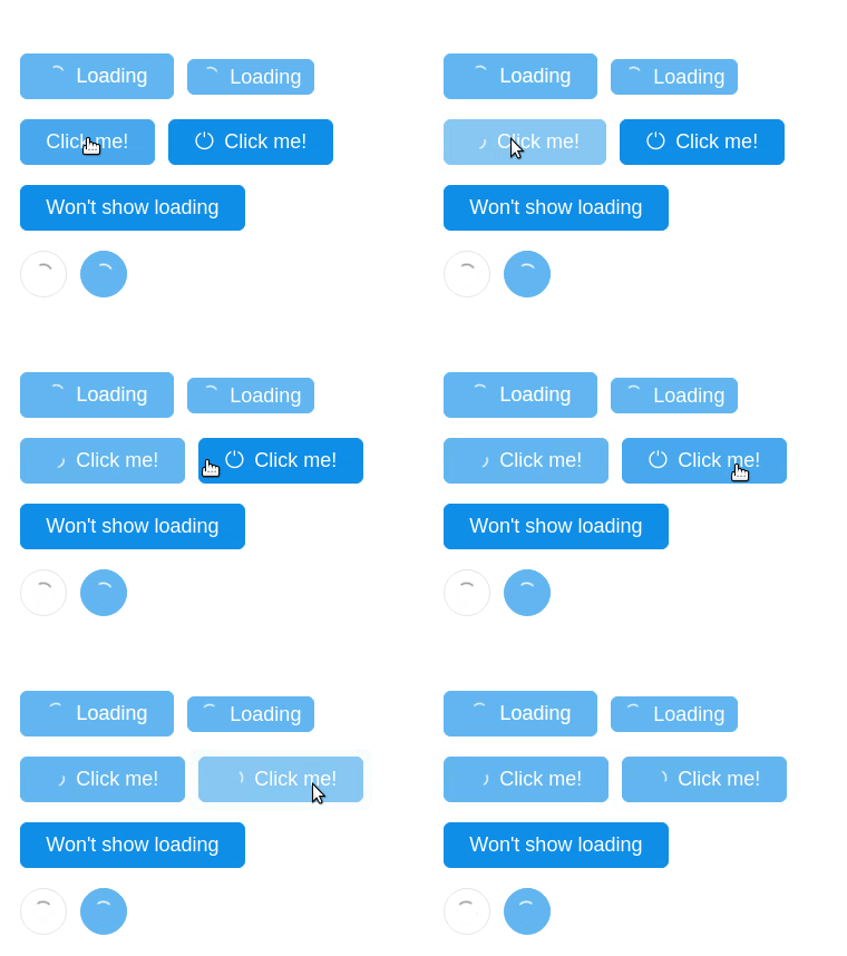
When passing loading property to the button, it will render with a small spinner.
<Button type="primary" loading={true}>
  Click me!
</Button>

So let’s have a look how the button handles it. It’s similar to what we’ve seen before.
componentWillReceiveProps(nextProps) {
  const currentLoading = this.props.loading;
  const loading = nextProps.loading;

  if (currentLoading) {
    clearTimeout(this.delayTimeout);
  }

  if (loading) {
    this.delayTimeout = setTimeout(() => this.setState({ loading }), 200);
  } else {
    this.setState({ loading });
  }
}
componentWillReceiveProps is invoked before a mounted component receives new props.
You can use this component lifecycle method to compare current props with
the upcoming ones and react to a change. But React may call this method even if the props have
not changed, so make sure to compare the current and next values if
you only want to handle changes.
What this method does for the button is quite simple, although I didn’t expect it.
It delays showing the spinner (when loading: true) by 200ms.
Also when the props change from false to true to false faster than in 200ms then
the spinner will not be shown at all. I think this is an interesting technique to
only show some kind of a delay indicator when the action is slower than a certain
threshold.
If you for example set loading property to true before doing AJAX call
and back to false after you have the results, you might want to show the
spinner only if it takes a bit longer to receive the response. If the network
and backend is fast, and you got everything done in 100ms, then it was so fast
that it is not even worth to present the loading state.
I think if I were to write this code I would explicitly handle 4 situations separately.
- false -> false
- false -> true
- true -> false
- true -> true
But I like the way this code is written as well. It remembers to clear previous callback and it schedules a new one. It is possible to receive true->true transition sooner than in 200ms but perhaps it is such a rare case that it wasn’t worth caring much about.
BTW, { loading } is a shorter syntax for {loading: loading}.
componentWillUnmount
componentWillUnmount is invoked immediately before a component
is unmounted and destroyed. It is a right place to perform cleanup.
To remove points of integration with the browser such as timers,
network requests, even bus subscribers, integrations with other
libraries. And the authors didn’t forget about it:
componentWillUnmount() {
  if (this.timeout) {
    clearTimeout(this.timeout);
  }
  if (this.delayTimeout) {
    clearTimeout(this.delayTimeout);
  }
}
We remove two timers that we met in previous parts. This is done only if they were actually scheduled.
Component description
I believe this is the moment where TypeScript comes into action and is
used to describe the Button component interface.
export interface ButtonProps {
  type?: ButtonType;
  htmlType?: string;
  icon?: string;
  shape?: ButtonShape;
  size?: ButtonSize;
  onClick?: React.FormEventHandler<any>;
  onMouseUp?: React.FormEventHandler<any>;
  loading?: boolean;
  disabled?: boolean;
  style?: React.CSSProperties;
  prefixCls?: string;
  className?: string;
  ghost?: boolean;
}

export default class Button extends React.Component<ButtonProps, any> {
}
This is also in some parts duplicated in PropTypes definitions.
export default class Button extends React.Component<ButtonProps, any> {
  static propTypes = {
    type: React.PropTypes.string,
    shape: React.PropTypes.oneOf(['circle', 'circle-outline']),
    size: React.PropTypes.oneOf(['large', 'default', 'small']),
    htmlType: React.PropTypes.oneOf(['submit', 'button', 'reset']),
    onClick: React.PropTypes.func,
    loading: React.PropTypes.bool,
    className: React.PropTypes.string,
    icon: React.PropTypes.string,
  };
Full code
You can see the version of Button that I described and the latest version. They are the same at the moment of writing this post, but they can diverge in time.
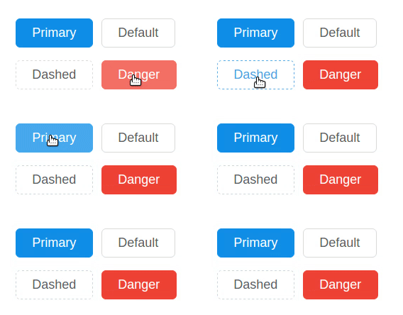
You can see the button in action on antd readme and if you are interested in the code used in those readme examples, it is also available.
Want more?
- Subscribe to our mailing list to keep receiving free React lessons.
- Buy our React.js by example book which is full of examples
- Time limited offer: The Missing Forms Handbook of React is available with 20% discount code: ARKENCY .
